
When someone dies, the family usually reaches for their phone within hours. They type something like “funeral directors near me” or “funeral home [town name],” they click the first two or three results, and they start scanning. Within fifteen minutes - often less - they’ve either found a number to call or they’ve moved on to the next firm on the list.
That window is brutally short. And what families are looking for in those minutes is not what most funeral directors think they’re looking for. Directors tend to evaluate their own websites in terms of brand, history, and professional credentials. Families in crisis are evaluating something far simpler: can I get what I need from these people, right now?
Most funeral home websites were built years ago and haven’t been meaningfully updated since. That’s not a criticism - when you’re running cases, managing staff, and answering calls at all hours, a website redesign sits permanently at the bottom of the list. But the gap between what your site offers and what families actually need when they land on it may be costing you cases you never even knew about. Nobody calls to tell you they chose someone else because your site didn’t load properly on mobile.
Here are the seven things families look for on a funeral home website, in rough priority order - and the mistakes that drive them away.
1. Can I Find Out What This Costs?
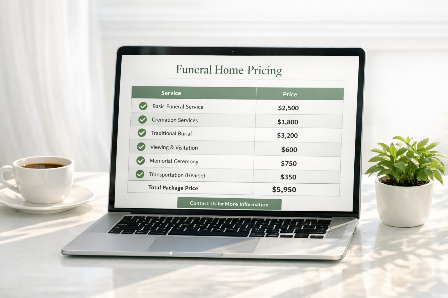
Pricing is the single most common reason families visit a funeral home website. Not reviews. Not your history. Not your team page. Price.
For most families, this comes from a fear of being blindsided rather than any urge to bargain-hunt. The SunLife Cost of Dying Report consistently shows that funeral costs are a major source of anxiety, with the average simple attended funeral in the UK sitting at approximately £3,828 and direct cremation at £1,628. Families want to know - before they pick up the phone - whether your services are within reach.
The common mistake: No pricing on the site at all, or a vague “prices from...” statement that tells the family nothing useful. Some directors worry that publishing prices will scare families off or invite undercutting from competitors. The evidence suggests the opposite - families who can’t find pricing simply leave. For a deeper look at whether to publish prices and how to do it well, see our posts on common pricing page mistakes and whether funeral homes should publish prices online.
Fix it
A clear, dedicated pricing page with starting prices for your core services. You don’t need to list every line item. You need to show enough that a family can gauge whether you’re in their range. For UK firms, the CMA Funerals Market Investigation Order already requires specific pricing transparency - check that your site meets the requirements.
2. Is This Place Near Me - Do They Serve My Area?
Location matters enormously, especially in rural areas where the nearest funeral director could be thirty miles away. Families want to confirm two things: where you’re physically located, and whether you cover the area where the death occurred or where the funeral will take place.
The common mistake: The address is buried in the footer in 10-point text, there’s no embedded map, and the site gives no indication of which towns, counties, or areas you serve. Multi-branch firms sometimes make this worse by listing all branches on a single page without making it clear which one is relevant.
Fix it
Your address and a Google Maps embed should be visible within one scroll on your homepage. If you serve a specific geographic area, say so explicitly. If you have multiple branches, make each one easy to find with its own page or a clear location selector.
3. Can I Trust These People?
Families are about to hand over one of the most important events of their lives to strangers. They are looking for trust signals - and they are very good at spotting fakes.
Google reviews are the single most powerful trust signal on a funeral home website. A firm with 40+ reviews averaging 4.8 stars tells a family more than any paragraph of copy ever could. Testimonials on the site itself carry less weight (families know you curate those), but they still help if they feel genuine and specific.
The common mistake: Stock photography. Nothing destroys trust faster than a website full of generic images - the woman gazing sadly at flowers, the perfectly lit chapel that clearly isn’t yours, the diverse group of mourners who look like they came from a casting call. Families can feel the inauthenticity instantly.
Fix it
Real photos of your premises, your vehicles, your team. They don’t need to be professionally shot (though it helps). They need to be yours. Display your Google review rating prominently. If you’re a member of NAFD, SAIF, or IAFD, show the badge - these carry recognition and trust, particularly among families who’ve done even minimal research.
4. What Are My Options?
Most families have never arranged a funeral before. They don’t know the difference between a traditional attended funeral and a direct cremation. They may not know that a cremation with a memorial service is an option, or that green burial exists, or that repatriation services are available.
The common mistake: Service descriptions written in industry shorthand. “Attended cremation service” means something specific to a funeral director. To a family at midnight, it means nothing. Worse, some sites list services as single-line menu items with no explanation - forcing the family to call just to understand what’s on offer.
Fix it
A dedicated services page (or individual pages per service) that explains each option in plain language. What does it include? What does it cost? Who is it right for? Think about the family member who has never done this before and write for them. “A direct cremation is a cremation without a funeral service beforehand. We collect your loved one, carry out the cremation, and return the ashes to you. It’s the most affordable option and is chosen by families who prefer to hold a memorial or celebration of life separately, or who simply want something simple and private.”
5. Can I Do Something Right Now?
A significant proportion of funeral home website visits happen outside business hours. Someone dies at 9pm on a Friday. The family starts searching at 11pm. They find your website. They’re ready to act - or at least to make first contact.
The common mistake: The only way to reach you is a phone number. If that number goes to voicemail outside office hours, the family either leaves a message and waits (feeling anxious and unhelped) or moves on to a firm with a 24-hour line or an online enquiry form.
Fix it
Multiple contact options visible on every page. Click-to-call for mobile visitors. An online arrangement enquiry form that lets them submit basic details at any hour. If you offer 24-hour phone support, make that unmissable. If you use live chat, keep it visible. The goal isn’t to replace the personal phone call - it’s to make sure a family visiting at 2am has some way to start the process and feel like they’ve taken the first step.
6. Obituaries and Tributes
Here’s a statistic that should change how you think about your website: obituary pages drive approximately 5x more website traffic than all other funeral home pages combined. Your obituary section is the front door to your whole website.
Every time a family, friend, or colleague visits to read an obituary, they’re seeing your website. That visit is a chance for them to notice your services, your reviews, your professionalism. It plants a seed for the future - the next time they need a funeral director, yours is the name they remember.
The common mistake: Obituaries published as plain text blocks with no photos, no links to your services, and no integration with the rest of the site. The highest-traffic pages on your entire website, treated as an afterthought.
Fix it
Design your obituary pages to reflect the care you put into your services. Include a photo, allow tributes or condolence messages, and ensure the page includes subtle navigation to your services and contact information. Every obituary page visitor is a potential future client. Don’t sell to them - but don’t hide from them either.
7. Do They Feel Like My Kind of People?
This one is harder to quantify but no less real. Families are looking for a fit - a sense that this funeral home understands them and will handle their loved one’s funeral in a way that feels right.
A family looking for a simple, modern celebration of life will be put off by a website that feels exclusively traditional and formal - dark colours, religious imagery, old-fashioned language. A family wanting a solemn Catholic funeral may feel uneasy with a site that reads like an events planning company. Neither reaction is wrong. Both are about alignment.
The common mistake: A website that reflects only one type of service or one type of family, when the firm actually serves a broad range. Or - equally common - a website so generic that it has no personality at all, giving the family nothing to connect with.
Fix it
Let your website reflect the range of families you serve. Show different types of services. Use language that is warm and professional without being locked into a single register. If you serve both traditional and contemporary families, your site should feel welcoming to both. Your imagery, your tone, and your service descriptions all send signals - make sure they’re the right ones.
The 2-Minute Challenge
Pull up your funeral home website on your phone right now. Pretend you’ve never heard of your firm. Pretend someone you love has just died and you found this site through a Google search.
Can you find the pricing? The address? The phone number? Can you work out what services are offered and roughly what they cost? Can you make contact if it’s outside business hours?
Time yourself. If it takes more than two minutes to answer those questions, the site needs work. Not necessarily a full redesign - sometimes it’s as simple as moving the phone number out of the footer, adding a pricing page, or replacing stock photos with real ones. Small changes, measured against what families actually need, can close the gap between a website that works and one that quietly sends people elsewhere.
Nobody calls to tell you they chose someone else because your site didn’t load properly on mobile. The families you lose to a poor website are the ones you never hear from at all.
Sources
- SunLife Cost of Dying Report (2024)
- CMA Funerals Market Investigation Order 2021
- IAFD Guidelines on Funeral Pricing Transparency